


Cumulative Layout Shift: Why CLS is Important for SEO and How to Improve It?
December 26, 2023Imagine you are about to click or tap a button on a website, and the button moves, and you end up clicking something else. Not just buttons, it happens with images, text, videos, and other interactive elements as well. This shift in elements is calculated through Cumulative Layout Shift (CLS), a crucial part of Core Web Vitals Metrics.
As a key metric, CLS measures the shifting or jumpiness of a website and to what degree things get displaced from the viewpoint. The good thing is, that developers are working on keeping these issues to the minimum as search engines like Google prefer a website that has a perfect score on Core Web Vitals.
Now, let’s learn more about CLS and see how it works, and what you can do for a perfect CLS score, eventually providing a good user experience and improving your chances of ranking higher in SERP.

What is Cumulative Layout Shift?
Cumulative Layout Shift (CLS) measures the number your site has unexpectedly shifted during its lifetime. For instance, if you are reading a page while it is loaded, and suddenly a banner loads, and, the page jumps goes down completely out of your view. In such cases, your site will get a large CLS score.
CLS is a part of Google’s Core Web Vitals, along with Largest Contentful Paint (LCP), and First Input Delay (FID). When web crawlers crawl your site, they check the CLS of each page. That’s why it’s equally important for developers to pay attention to CLS as LCP and FID.
What is a good CLS score?
A cumulative layout score of less than 0.1 is considered good. Meanwhile, a score between 0.1 and 0.25 requires improvement, and a score greater than 0.25 is poor and needs immediate attention.
Importance of CLS
According to a report published in 2020, 93 percent of people have reported leaving a site when it didn’t load properly.
If your site gets jumpy or loads haphazardly, it may persuade your visitors to leave or look somewhere else. A high CLS score can cause serious usability issues in your website. This includes tapping or clicking on the wrong option. For instance, you might end up clicking on sign up, while clicking sign in, as both the buttons are closer.
A jumpy site can also make you leave a site early out of frustration, or you may miss out on other features or elements of the website due to this shift in elements. The major problem arises when you try to access a website on a smartphone. Viewing on a small device poses more challenges as even a small shift can make a great impact on the user experience.
Another thing, Google ranks a website as per its page performance. Meaning, that if you provide a better user experience, they will spend more time on your site. This will eventually push your page on the SERP ladder. On the other hand, if your website doesn’t meet the Core Web Vitals standard, your site may be penalized. The logic is simple- Google or any search engine wouldn’t suggest pages to their users that don’t perform well.
The reason behind High Cumulative Layout Shift in Websites
Page shifts usually happen when contents on a webpage load at different speeds, causing a series of layout changes. This includes ads loading at a slow pace, videos popping up out of nowhere and DOM elements being added dynamically to existing content.
For example, if an ad banner is loaded after all the web page loads, it will push the whole content down and disrupt the user experience.
Unexpected shifting of elements on a page usually happens when DOM elements are dynamically added to existing contents or a page is loaded asynchronously. It might happen due to an image or video with unknown dimensions, a font that gets larger or smaller after it renders completely, or 3rd party ad or widget that resizes itself dynamically.
Challenges with CLS
The Cumulative Shift Mertic (CLS) helps in addressing issues causing shifting in page layouts. However, it is a challenge for developers it is hard to know if their users are experiencing layout shifts in real life. This is because page loading differs for every device or environment. The issue becomes more challenging because the way a website works during development can be quite different from how users actually experience it.
The thing is personalized and 3rd party content doesn’t behave similarly during the development process as it does in the production stage. During development, test images are often stored in the developer’s browser cache, making them load faster. However, real users may not have these images cached, leading to different loading times. API calls made locally during development are often very fast, and developers might not notice any significant delays. However, in the actual production environment, these API calls may take longer, affecting the user experience.
Ways To Accurately Measure CLS Metric
Use web tools like Lighthouse and Page Speed Insights
Lighthouse provides you the CLS metric along with other Core Web Vitals. Meanwhile, Google PageSpeed Insights provide a more detailed analysis of a page performance, including CLS. It also offer suggestions for improvements.
To Check CLS using PageSpeed Insights
- Open PageSpeed Insights (web.dev)
- Enter your URL in the search box
- Click Analyze
Furthermore, you can choose CLS and other vital for mobile and desktop individually.
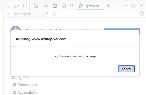
To Check CLS Using Lighthouse Tool
Open the page you want to analyse in chrome or edge
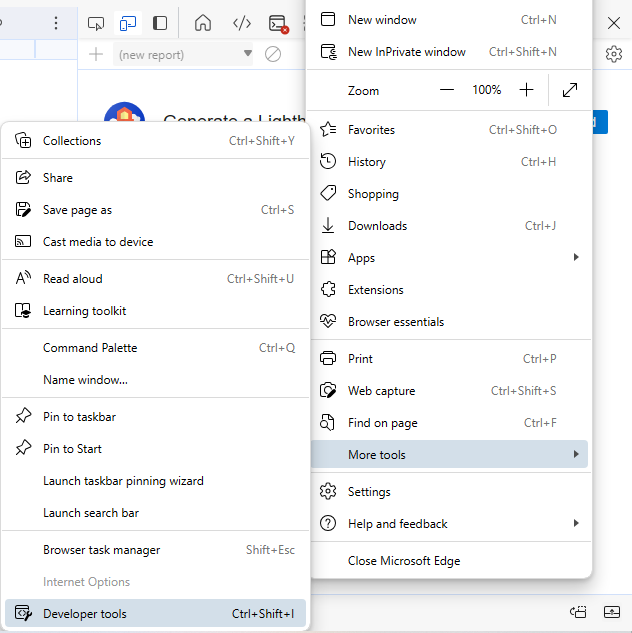
Go to Developer Tools by clicking the three dots on the top right corner of the browser
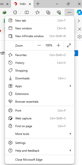
Select “more tools”, followed by “Developer Tools”.
Choose “Lighthouse” from the options
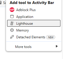
Click “Generate Report”.
Real User Monitoring (RUM) tools
Google Analytics track real user interactions and provide insights on how they interacted with a page.
Logging and Analytics
Implement logging and analytics in your web application to capture user interactions and measure CLS. Log relevant data that can help you identify instances of layout shifts and their impact on the user experience.
User Feedback
Encourage users to provide feedback on their experiences, especially if they encounter layout shift issues. User feedback can used along with quantitative metrics to get valuable insights into specific pain points.
Test your Website in Various Environments
Test your website in different environments, devices, and network conditions to simulate a variety of user experiences. This includes testing on various browsers, devices, and connection speeds.
How to Improve Your Cumulative Layout Shift Score?
Cumulative Layout Shift is a valuable insight that help your website to rank higher in Search Engine Results Page (SERP) of Google, Bing, and other search engines. If your website’s CLS score is high, congrats. Now check the score of other core web vitals, and check the optimization score of your website.
If your site scored poorly, then don’t worry. It’s pretty common for websites to have poor score, and with the right measure you can easily improve it. However, you may need the help of professional web developers for that.
Here are the steps to take for optimizing your CLS metric
Define dimensions for Images and Videos
Images
Unexpected shifts in webpage can easily be avoided by adding width and height size attributes for all image and video elements. This way, the browser will reserve the necessary space for an image, and reduce unexpected shifts.
Employ the “max-width: 100%” CSS rule for images to ensure they don’t exceed their container size. This is particularly important for responsive design.
Consider using Lazy loading for images. This makes the images load only when they enter the viewport. This minimizes initial page load time, and significantly reduces the occurrence of layout shifts.
Videos
Define the aspect ratios of videos by using the width and height attributes. If you are using embedded videos, make sure the height and width attributes are included in the embed code or iframe. Similar to images, consider lazy loading videos to defer their loading until they are needed.
Set Width and Height for Banner Ads, Embeds, and iFrames
Setting explicit dimensions for banner ads, embeds, and iframes is important for maintaining a stable layout and improving the user experience.
Here are examples of how you can set width and height for each:
Banner Ads:
<!DOCTYPE html>

<html lang="en">

<head>

    <meta charset="UTF-8">

    <meta name="viewport" content="width=device-width, initial-scale=1.0">

    <title>Banner Ad Example</title>

    <style>

        .banner-ad {

            width: 728px; /* Set the desired width */

            height: 90px; /* Set the desired height */

        }

    </style>

</head>

<body>

    <div class="banner-ad">

        <img src="ad-banner.jpg" alt="Banner Ad">

    </div>

</body>

</html>
In this example, the .banner-ad class sets the width and height of the container. Adjust the values based on the specifications provided by the ad provider.
Embeds (e.g., YouTube Video):
<!DOCTYPE html>

<html lang="en">

<head>

    <meta charset="UTF-8">

    <meta name="viewport" content="width=device-width, initial-scale=1.0">

    <title>Embed Example</title>

    <style>

        .embed-container {

            position: relative;

            width: 100%;

            height: 0;

            padding-bottom: 56.25%; /* 16:9 aspect ratio */

        }

        .embed-container iframe {

            position: absolute;

            width: 100%;

            height: 100%;

        }

    </style>

</head>

<body>

    <div class="embed-container">

        <iframe src="https://www.youtube.com/embed/your-video-id" frameborder="0" allowfullscreen></iframe>

    </div>

</body>

</html>
In this example, the .embed-container class maintains a responsive aspect ratio for the embedded content. Replace “https://www.youtube.com/embed/your-video-id” with the actual embed URL.
iFrames:
<!DOCTYPE html>

<html lang="en">

<head>

    <meta charset="UTF-8">

    <meta name="viewport" content="width=device-width, initial-scale=1.0">

    <title>iFrame Example</title>

    <style>

        .iframe-container {

            width: 800px; /* Set the desired width */

            height: 600px; /* Set the desired height */

        }

        .iframe-container iframe {

            width: 100%;

            height: 100%;

            border: none; /* Remove border if needed */

        }

    </style>

</head>

<body>

    <div class="iframe-container">

        <iframe src="your-iframe-content.html"></iframe>

    </div>

</body>

</html>
In this example, the .iframe-container class sets the width and height of the container. Adjust the values based on the requirements of the content you’re embedding.
These examples are just for references, and you should customize the dimensions based on your specific needs and design considerations. Plus, always ensure that the specified dimensions align with the recommendations provided by the ad network, embed provider, or content source.
Add Custom Font to Your Website
Adding a custom font can improve your CLS Score by:
Preventing Flash of Invisible Text (FOIT):
When a webpage loads, browsers initially render text using a default font and then switch to the custom font once it’s downloaded. This process can cause a Flash of Invisible Text (FOIT), leading to sudden and unexpected layout shifts. By specifying a custom font in the HTML and CSS, you reduce the chances of FOIT, providing a more stable and consistent user experience.
Avoiding Flash of Unstyled Text (FOUT):
Flash of Unstyled Text (FOUT) occurs when the default font is displayed before the custom font is loaded. This can also result in unexpected layout shifts as the text changes appearance. Specifying the custom font in the HTML and CSS helps minimize FOUT, ensuring that the correct font is applied once it becomes available.
Ensuring Predictable Text Sizes:
Custom fonts often have different metrics compared to default system fonts. If your website relies on system fonts, the shift to a custom font can lead to changes in text size and spacing, causing layout shifts. By using a custom font and defining its characteristics in your CSS, you ensure more predictable text sizes and reduce the likelihood of layout shifts.
Optimizing Font Loading:
Custom fonts loaded from external sources, such as Google Fonts, are often optimized for performance. These services employ techniques like preloading and font subsetting to ensure efficient and fast loading. Properly configured font loading can help minimize delays in rendering and reduce the chances of layout shifts during the loading process.
How to Add Custom Font to your Website?
- Choose a Font: Visit Google Fonts and choose a font that fits your website’s design and branding. Once you’ve selected a font, click on it, and you’ll see an option to customize.
- Customize and Get the Code: Customize the font as needed (weight, style, etc.), and click on the “Embed” tab. You’ll see code snippets that you can add to your HTML or CSS.
- Add the Font Link to HTML: Copy the provided link tag and paste it into the section of your HTML document. This will load the font from the Google Fonts CDN.
Replace YourSelectedFont with the actual name of the font you selected.
- Apply the Font in CSS: In your CSS, use the selected font for the desired elements. This ensures that the custom font is applied to your website’s text.
body {
font-family: ‘YourSelectedFont’, sans-serif;
}
This CSS rule sets the custom font for the entire body of your website. Adjust it based on your specific styling needs.
- Ensure Proper Loading: Ensure that the font is loading asynchronously and doesn’t block rendering. You can achieve this by using the async attribute in the tag:
Review Dynamically Injected Content
Websites often use dynamic contents to persuade users to make a specific action. However, new elements popping up at the top or bottom of page, can create a shift in content. Hence, keep your dynamic content to a limit. Review dynamically injecting content though the following:
- Inviting Users to Initiate Changes:
- Implementation: Introduce user interaction elements, such as a “Read more” button or a “Refresh” button that users can voluntarily click to trigger the loading of new content.
- Considerations: Ensure that layout shifts triggered by user interactions are kept within 500ms to align with the best practices for CLS.
- Loading Content Off-Screen:
- Implementation: Load dynamic content off-screen, outside the user’s viewport, and use an overlay or notification (e.g., a “Scroll Up” notification) to invite users to view the new content when they choose to do so.
- Considerations: Since off-screen shifts do not contribute to CLS, this approach helps maintain a stable on-screen layout.
- Using a Fixed Size Container:
- Implementation: Utilize fixed-size containers, such as carousels, to present dynamic content. Carousels can be a suitable alternative if the new content replaces an existing element, helping to prevent layout shifts.
- Considerations: Ensure that any interactive elements like links or controls within the fixed-size container wait for the transition to avoid accidental clicks and potential disruptions.
Conclusion
As with any web development strategy, testing and monitoring are key. Regularly review your site’s performance using tools like Google Lighthouse, PageSpeed Insights, or browser developer tools to ensure that these implementations effectively minimize layout shifts and contribute to a positive user experience.