


Web Design Trends To Watch Out For In 2024 – Latest Trends in Colors, Fonts, Layouts, Animations That Will Be Popular For Websites
February 16, 2024
People change along with time, and vice versa. Technology also changes with people, making their life better.
Those were a simpler time, when websites used to be static, with a handful of fonts, colours, and layouts. Today, we’re amidst a digital renaissance, where websites are not just sources of information but platforms for delivering value and immersive experiences. The evolution is evident, showcasing the remarkable progress of digital technology.
In this digital battleground, each website competes for audience attention, driving the need for constant innovation.
As we look ahead to 2024, let's explore some trends shaping the future of web design.
Dynamic Color Gradients
Dynamic color gradients have become a popular trend in web design, offering designers the opportunity to create captivating designs. It includes blending different hues, and gradients to add depth and dimension to websites. Contrary to old-school solid colors, dynamic color gradients enhance the site’s overall aesthetics while offering several branding advantages.
Gradients are now being added to various design elements including backgrounds, overlays, and buttons. Not only designers, but they are quite popular among users due to their vibrant and energetic color palettes that enhance the overall look of the user interface.
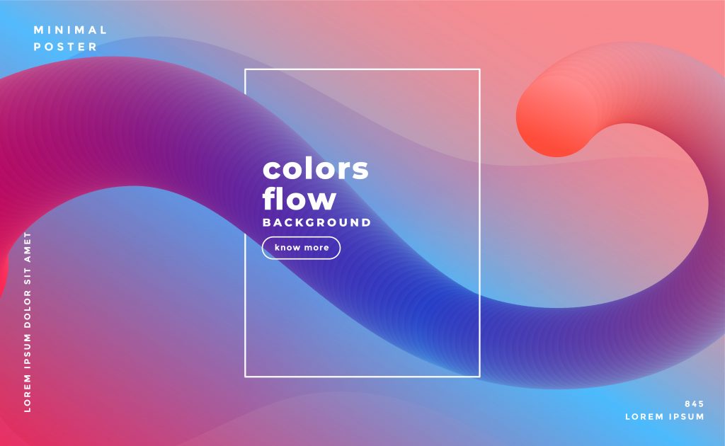
From subtle transitions to bold color combinations, dynamic gradients can evoke different moods and emotions, making them suitable for a wide range of design styles. As a flexible and impactful design element, dynamic color gradients will continue to be embraced by designers seeking to create immersive and engaging web experiences.
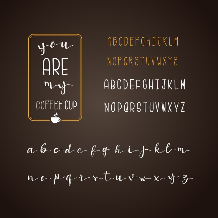
Variable Fonts
Variable fonts offer designers great control over text appearance and readability. Variable fonts are special font files that contain multiple styles (boldness, width, and slant) within one file. Traditional fonts are static and don’t offer much flexibility with customization or adaptability.
Meanwhile, variable fonts contain multiple variations within a single file, allowing dynamic adjustments in weight, width, slant, and other attributes. This allows designers to create smoother transitions between font styles and achieve a wider range of typographic effects with greater efficiency.
Experimental Grid Systems
Break free from those rigid Column structures and embrace the new-age dynamic grid designs to captivate your users’ attention and make them explore more.
Some of the experimental grid systems include:
Modular Grids: They allow designers to work with more flexible and asymmetrical layouts. Content blocks are arranged in a modular fashion, with each module having its own defined area and spatial relationships.
Masonry Grids: Popularized by platforms like Pinterest, masonry grids use a cascading arrangement of content blocks with varying heights and widths. This creates an organic and dynamic layout where items fit together like a puzzle, adapting to different screen sizes and orientations.
Fluid Grids: Fluid grids utilize percentages rather than fixed units for column widths, allowing content to resize and reflow smoothly across different screen sizes and devices. This approach promotes responsive design principles and accommodates the growing diversity of screen resolutions. It adds a layer of engagement and interactivity to the browsing experience, enhancing user involvement and immersion.
Collage Layouts: Collage layouts break free from the traditional grid structure by overlaying and juxtaposing images, text, and other elements more artistically and expressively. This approach lends itself well to creative portfolios, art galleries, and multimedia-rich websites.
Vertical Grids: Departing from the horizontal emphasis of traditional grids, vertical grids organize content primarily along the vertical axis. This can create a unique browsing experience, particularly suited for storytelling websites or timelines where scrolling vertically reveals new content layers.
Dynamic Grids: Dynamic grids introduce interactive elements and animations to the grid layout, allowing users to manipulate and rearrange content on the fly.
Interactive Storytelling:
Interactive storytelling is setting the whole digital landscape on fire by bringing more immersive and captivating experiences.
Some cool elements for interactive storytelling include:
Parallax Scrolling: This allows designers to create the illusion of depth and movement as users scroll down the page. This technique involves different layers of content moving at varying speeds, creating a dynamic and visually captivating experience. Parallax scrolling can be used to highlight key content elements, guide users through storytelling narratives, or simply add a touch of visual flair to the website.
Interactive Timelines: They provide a chronological overview of events, stories, or data points, allowing users to explore content in a linear fashion. Designers can use interactive features such as hover effects, click interactions, or drag-and-drop functionality to engage users and encourage exploration. Interactive timelines are particularly effective for showcasing historical events, project milestones, or company achievements in an engaging and informative manner.
Video Backgrounds: Video backgrounds offer a dynamic and visually striking backdrop for web content, instantly capturing users’ attention and setting the tone for the website. Whether it’s a looping video of nature scenes, abstract animations, or product demonstrations, video backgrounds can create a powerful visual impact and convey brand identity effectively. Designers can utilize video backgrounds to enhance storytelling, showcase products or services, or create immersive atmospheres that resonate with users.
3D Elements and Augmented Reality
2004 is the year to incorporate 3D elements and augmented reality (AR) into web design, creating immersive experiences that blur the line between the real and digital worlds.
Immersive 3D Graphics: You can incorporate interactive 3D models and graphics to create visually stunning and engaging environments. They are great for product showcases to virtual tours, allowing users to interact with lifelike 3D elements that bring content to life.
Augmented Reality Integration: AR technology has become more prevalent in web design, allowing users to overlay digital content in the real world through their device cameras. They can be used for virtual clothing, visualizing furniture in their homes, and more.
Interactive 3D Navigation: Adopt 3D navigation menus and interfaces to provide users with intuitive and immersive ways to explore content. Use interactive 3D maps, carousels, and menus to enhance user engagement and streamline navigation.
Animated 3D Backgrounds: Dynamic and animated 3D backgrounds are going to replace traditional static images, adding depth and movement to web pages. These immersive backgrounds will captivate users’ attention and create memorable visual experiences.
Virtual Product Try-Ons: E-commerce websites can take advantage of AR technology to enable virtual product try-ons, allowing users to visualize how products look and fit in real-world settings. From trying on virtual makeup to test-driving virtual cars, users will enjoy a more immersive shopping experience.

Voice User Interfaces (VUIs)
Voice User Interfaces (VUIs) will play a significant role in web design in 2024, revolutionizing how users interact with websites and digital platforms. With the rise of smart speakers, virtual assistants, and voice-enabled devices, VUIs offer a more natural and intuitive way for users to navigate and access information online.
Enhanced Accessibility: VUIs improve accessibility by enabling users with disabilities or impairments to interact with websites through voice commands, providing a more inclusive browsing experience.
Seamless Interaction: VUIs allow for seamless interaction with websites, enabling users to perform tasks, search for information, and complete transactions using voice commands, without the need for traditional input methods.
Personalized Experiences: VUIs enable personalized experiences by recognizing individual voices and preferences, and tailoring content and recommendations based on user interactions and past behavior.
Faster Navigation: VUIs facilitate faster navigation of websites, allowing users to quickly find information, navigate menus, and access specific pages using voice commands, improving overall user experience and efficiency.
Multi-Platform Integration: VUIs are integrated across various platforms and devices, including websites, mobile apps, smart speakers, and wearable devices, ensuring consistent and seamless experiences across different channels.
Evolving Technology: Advances in natural language processing (NLP) and machine learning enable VUIs to understand and interpret user queries more accurately, enhancing the effectiveness and reliability of voice interactions.
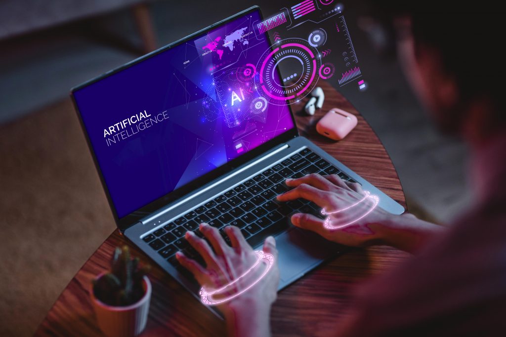
AI Integration
Artificial intelligence (AI) will be increasingly integrated into web design, powering personalized recommendations, predictive analytics, and other smart features. Expect to see more websites benefit from AI algorithms to analyze user behavior, predict preferences, and deliver tailored content and experiences.
From personalized product recommendations to chatbots that provide instant customer support, AI-powered features will enhance usability and convenience for users. As AI technology continues to advance, designers will find new ways to leverage AI algorithms to create smarter, more intuitive web experiences that anticipate and meet users’ needs.
Dark Mode
Dark mode is all the rage these days! It’s sleek, easy on the eyes, and perfect for browsing in the dark. You’ll start noticing more websites offering dark mode options, giving you a chill viewing experience no matter the time of day. With dark backgrounds and light text, it’s all about that cool contrast.
Dark mode themes typically feature dark backgrounds with light text and accents, creating a high-contrast interface that is easy on the eyes. As users increasingly seek out dark mode options across platforms and devices, it is a smart choice for developers to prioritize dark mode compatibility in their web designs in 2024. From social media platforms to productivity apps, dark mode will continue to be a prevalent trend in web design, offering users greater flexibility and customization options.
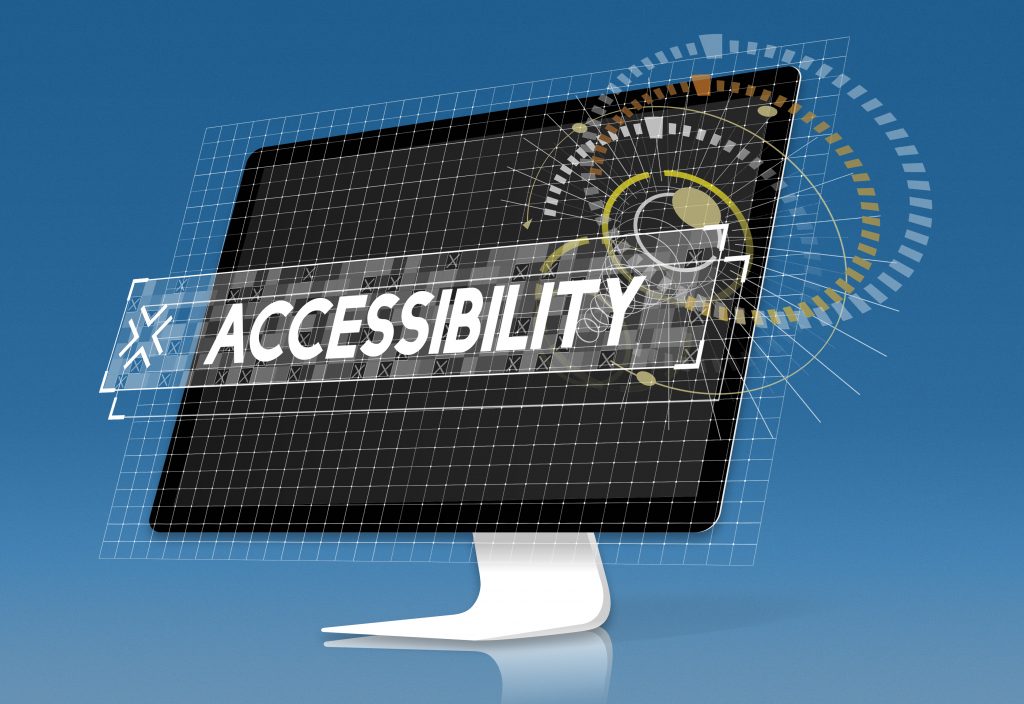
Accessibility
In 2024, web accessibility has become non-negotiable. With a heightened emphasis on inclusivity, web designers now view features like alt text, keyboard navigation, color contrast, and ARIA labeling as essential design elements, rather than mere accommodations.
By integrating accessibility into the core site structure, designers ensure fair access for users of all abilities. Adherence to WCAG standards isn’t just recommended – it’s an ethical imperative.
As awareness spreads, web accessibility evolves from a concept to a moral and commercial imperative. An accessible site demonstrates an organization’s commitment to its diverse user base, showcasing care and consideration. It’s not just a good idea – it’s essential.
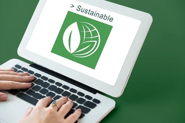
Sustainability
Sustainable web design aims to reduce the internet’s carbon footprint through optimized performance, renewable hosting, mindful coding, and industry advocacy.
By championing simplicity in aesthetics and efficiency in architecture, designers build flexibility into sites to minimize waste. Cleaner code, conscientious hosting, and thoughtful content delivery choices lessen server and data demands.
Beyond individual sites, collectively advocating for renewable web infrastructure and raising awareness for sustainability best practices facilitates an environmentally-conscious internet ecosystem.
Sustainable web design ultimately creates functional, appealing sites aligned to broader climate goals. With environmental impact no longer an afterthought, these principles tackle waste at its digital source. For climate-conscious designers, building a greener web is both a creative challenge and a moral purpose.
Conclusion
The digital landscape continues to transform rapidly, with technology and user expectations pushing each other to new heights. Where static websites once stood, dynamic platforms now engage audiences with rich experiences that add tangible value.
As competition reaches new intensity levels, innovation has become the fuel to move experiences forward. To stand out in a crowded landscape, brands must embrace technology’s ever-evolving nature, using it as a catalyst for continuous improvement. By constantly optimizing platforms and experiences to satisfy user needs, digital products can evolve symbiotically alongside their audiences over time. The future will reward those who lean into change, letting it guide their path to stay cutting-edge.